Picking the right background color can make your photos shine. But with so many color options, settling on the perfect match for your picture can seem tricky. This simple guide breaks down how to pair hues effectively, which mood each color conveys, ideal color combinations, and more insider tips for selecting winning backgrounds whenever you take a picture.
Before reading this guide, there are clever AI tools that can auto-remove your photo backgrounds if you don't nail the backdrop color. Features like the Imagewith.AI Outcut feature can help you remove your photo's background with just a few clicks.

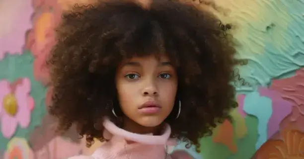
How I Get The Perfect Photography Background Colours
Which Is the Best Background Color for Photos
Choosing the ideal backdrop color can affect your photographs. Some colors complement subjects beautifully or help set just the right mood. Here, we explore winning background color options for various photography options so your images will be guaranteed to impress every time.
White Backgrounds

Black Backgrounds

Colorful Backgrounds

Best Background Color for Clothes
Solid colors work best for clothing background colors. Black, white, gray, navy, or beige colors are good choices. These colors are relatively quiet and engaging. They let people focus on the clothes instead of the background.
Make sure the backdrop color goes well with the clothing colors. For example, a red top looks good against a navy background. The two colors complement each other.
Neutral background colors like white, black, or gray are also good. These let the clothes stand out since there are no competing colors. Neutral backdrops give a clean, simple look that highlights the clothes.

Simple background patterns can work if they are bold enough. Subtle stripes or solids are best. Busy or bright patterns take attention away from the clothes.

Proper lighting is important, too. Ensure the clothes are lit well so all the details can be seen. The backdrop should stay subtle and not draw attention from the clothing.
Best Background Color for White Objects
Solid color backgrounds work best for white objects. Black backgrounds make white objects stand out and create a bold, high-contrast look. Off-white, gray, and beige are also good. These colors soften the white object, making the image more subtle and neutral. Dark navy or blue also looks nice with white. The darker color makes the white seem even brighter.

Best Background Color for Photo Editing
Clean white or light gray make professional, uncluttered backgrounds. These let the focus stay strongly on the main photo subject. Black can look sleek but creates extremely high contrast with light elements. Using dark gray instead eases a very bold contrast.


Neutral grays/whites, black, and smooth textures work best. Avoid bright colors or busy patterns that distract from the main editing focus. Let the subject take center stage.
Best Background Color Aesthetic
What "aesthetic" you want determines the backdrop color that works best. Pastels like powder blue, lavender, pale yellow, or pink make pleasing backgrounds for a bright, cheerful mood. They provide a soft, positive feel. For deeper emotion, rich colors like emerald, ruby, or navy set an intense tone.

Monochromatic backdrops also have a sleek, elegant look. Different shades of one hue -- light blue fading into dark blue, for example -- give cohesion. Going vibrant to muted in the same shade creates depth and interest.
Classic black and white reads timeless and dramatic. Crisp white makes elements stand out in the foreground. Inky black heightens an intimate, cozy ambiance. Pairing provides contrast and balance.

Textured backgrounds complement an aesthetic when the texture fits the vibe. Weathered wood or worn concrete convey an earthy feel. Brushed metal or liquid sheens give an ethereal, magical air. Keep textures subtle so they support, not overtake.
Best Background Color CSS
When styling with CSS, picking the right background color involves aesthetics and accessibility. You want the combination of foreground and background colors to look pleasing but also meet contrast standards so the text is legible.

Cool tones like blues, greens, and grays make calming, professional backgrounds. Warm tones like tans, pinks, and yellows suggest fun or energy. Dark shades tend to recede; light ones come forward. Neutral whites and grays reliably complement colored text.
Be sure to check contrast ratios to ensure accessibility. Black text on a white background provides the best contrast and readability. Light text on darker backgrounds works if there is adequate brightness difference. Tools can help test combinations.
Consider how backgrounds and text interact when viewed on various devices. Brighter colors may overpower text on smaller mobile screens even if they pass standard vision tests. Define media queries to adjust styling across contexts.
Best Background Color in HTML
When adding background colors in HTML, using basic color names like "white" and "black" or hex codes like "#000000" is best for wide compatibility across browsers. Named colors are automatically translated, while hex codes are precisely defined. This avoids inconsistencies in rare browser cases.

Be sure enough color contrast exists between foreground text and background layers for accessibility, too. Black text on a white background provides the highest contrast and readability. Darker backgrounds can work with lighter font colors if the brightness difference is substantial enough.
Consider how backgrounds appear on various screen sizes as well. Bright colors easily read on a desktop may strain visibility when viewed on a small mobile device. Use CSS media queries to adjust styling accordingly per context.
Set background color in HTML | HTML5 Tutorial
Best Background Color for Drawing
The white of blank paper or drawing sketchbooks provides the ideal neutral background for most drawing needs. Pure white enables maximum value contrast so all shades clearly show. It allows total freedom to capture both lights and darks. Similar off-white, cream, or light gray backdrops subtly complement without confusing values.


Take care with brightly colored backgrounds competing with focal elements. Intense yellow, for instance, may overpower red subject matter meant to stand out. Black backgrounds risk muting lighter drawing aspects. But high contrast can be bold if managed.
Which Background Color Is Most Attractive?
Research shows both blue and green backdrops rate highly attractive and pleasing. These cool, nature-inspired hues relax viewers, supporting comfortable observation. Soft blue-greens and aquas especially draw positive reactions. Mid-range tones like royal blue also appeal.
Metallic-inspired accents like silver, gold, and bronze seem sleek and upscale when applied to accents. But full backgrounds soon fatigue the eye. Use sparingly on design elements with plenty of white space for balance.
For best results, stick to one or two key backdrop colors with slight variations in shade. Whether warm, cool, or in between, simplicity helps backgrounds look their best.
What Is the Most Popular Backdrop Color?
Overall, some shade of blue makes the most sought-after and widely used backdrop color. Blue conjures feelings of trust, tranquility, and professionalism. Light blues seem cheerful. Darker blues are traditional and authoritative. Blue works well in designs for technology, finance, healthcare, and more serious institutions.
Black follows closely as an extremely popular background choice. Black builds a contrast to make other elements pop. It suggests luxury and modern sleekness. Black sets an elegant, dramatic mood. It fits well with bold graphics, products, and artistic promotion.
What Is the Most Professional Background Color?
Different shades of blue look the most professional. Dark blues seem serious and wise. Light blues feel calm. Blue makes people trust you and think you know what you're doing. Blue works well for business, money, and science sites.
Grays also seem professional. Light gray is clean and modern. Dark gray looks exclusive. Gray says you have experience. Different grays make good backgrounds for respectable sites.
White and off-white say "clean" and "simple." Crisp white feels high-tech and tidy. Cream white is friendly. Whites allow other colors to stand out. Many professional places use white backgrounds.
Overall, grays and whites make the best professional backdrops. Blue feels smart. Gray seems refined. White reads organized. These say you are capable and should be taken seriously. They help earn trust in all fields.
What Is the Most Readable Background Color?
Black text on a white background is scientifically the most easily readable color combination. The highest contrast between the stark black text and the bright white backdrop enables effortless reading comprehension. This high contrast causes minimal eye strain.
Off-white and light gray backgrounds also enable decent text readability. Though these muted backdrops decrease contrast slightly, lighter font shades offer a comfortable reading flow.
Light blue hues also make fairly readable backgrounds, adding a more visually engaging effect. Medium blues, however, may impede easy reading, especially at smaller font sizes. Be sure the text passes minimum contrast ratio guidelines.
Always check sufficient contrast between text and its immediate backdrop for an effortless, inclusive reading experience across contexts.
Conclusion
Choosing the ideal backdrop color is key to making your photographs shine. Consider how each hue sets the mood - white for crisp and classic, black for dramatic, and colors that evoke targeted responses. Use solid tones behind clothing and white objects so textures stand out. Blend into the background for a polished aesthetic or make elements pop for edits.
Accessibility matters, too, so ensure readability with sufficient contrast. Overall, let color complement without overwhelming. Then, subjects sparkle, and images convey each intended effect, from cheerful to elegant. With the tips explored here, you now have essential guidance for selecting background colors to optimize shots in every context.